I've been building all kinds of map examples for MapJSON. As a consumer, I've always appreciated examples where I can interact with a service and visualize it instead of just reading about it in the docs. But today, I want to share examples that are more art than a map, but still built from real map data.
First, Mondrian's World, inspired by the Dutch painter Piet Mondrian:
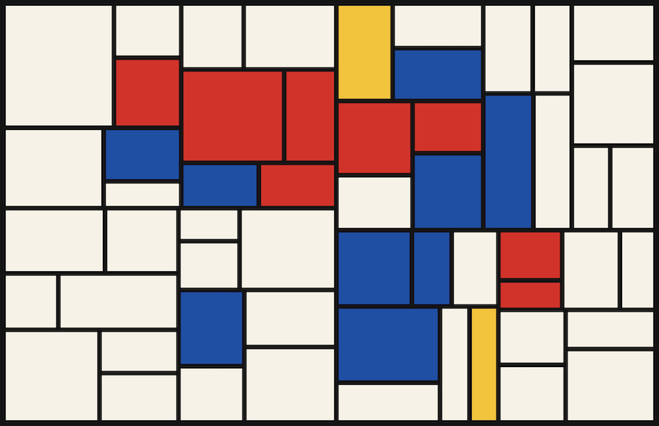
The geographical data only sets each rectangle's color (a cell is sampled against the land mask and assigned a random primary if it's mostly land, left white if mostly ocean) while the rectangles come from "Mondrian" math that ignores coastlines entirely.
I used more of the map data in this symmetrical kaleidoscope made from country borders, called World Mandala:
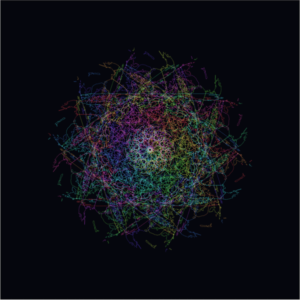
Every country's outline is drawn ten times, each copy rotated a little more around the center, with the colors added together so they brighten when lines cross.
In a similar style, there's Stacked Bloom:
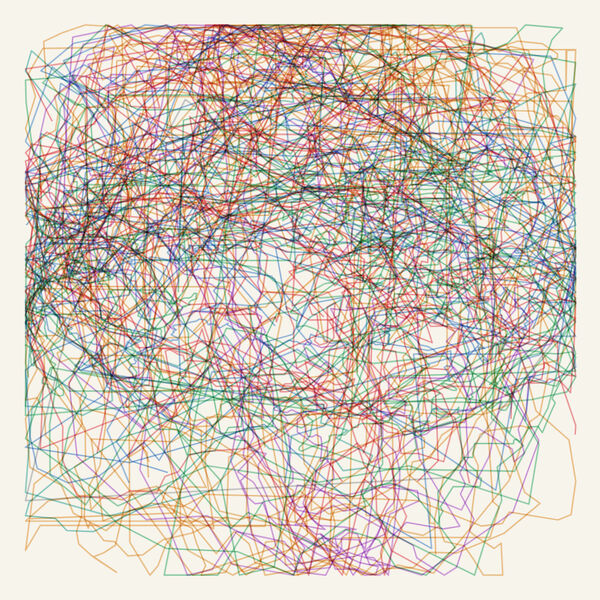
This time country outlines are scaled to the same size and stacked on a single point, tinted by continent in ink that darkens where they overlap.
Recently, I had to fix the areakm property on countries for micro-states like Monaco and Vatican City, so using that property, here's Dorling Earth, where every country becomes a circle sized by its land area:
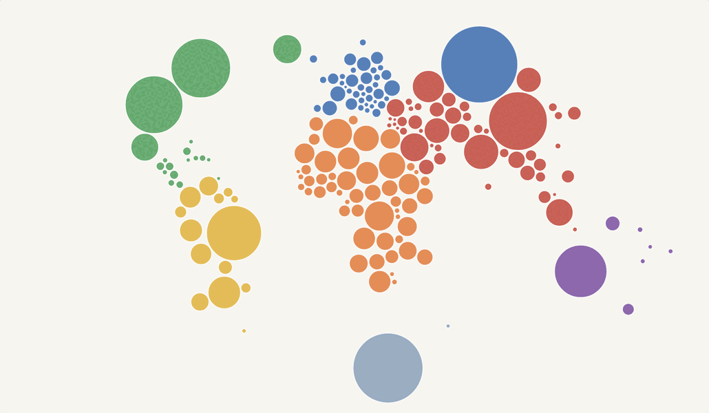
A force simulation packs the circles, each pulled toward its real position but never allowed to overlap.
Now something more recognisable: a world map inspired by Bridget Riley's Op Art painting Current.
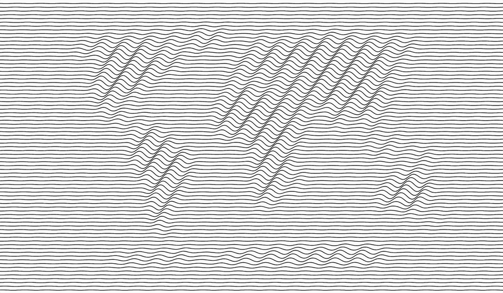
Just black lines on white. Over ocean they run almost straight, over land they ripple into tight waves, so the world shows up without any coastline being drawn. You might also like two variations on it: Rings and Spectrum.
And if we're making something recognisable, here's Stained Glass Earth, built from Voronoi panels:
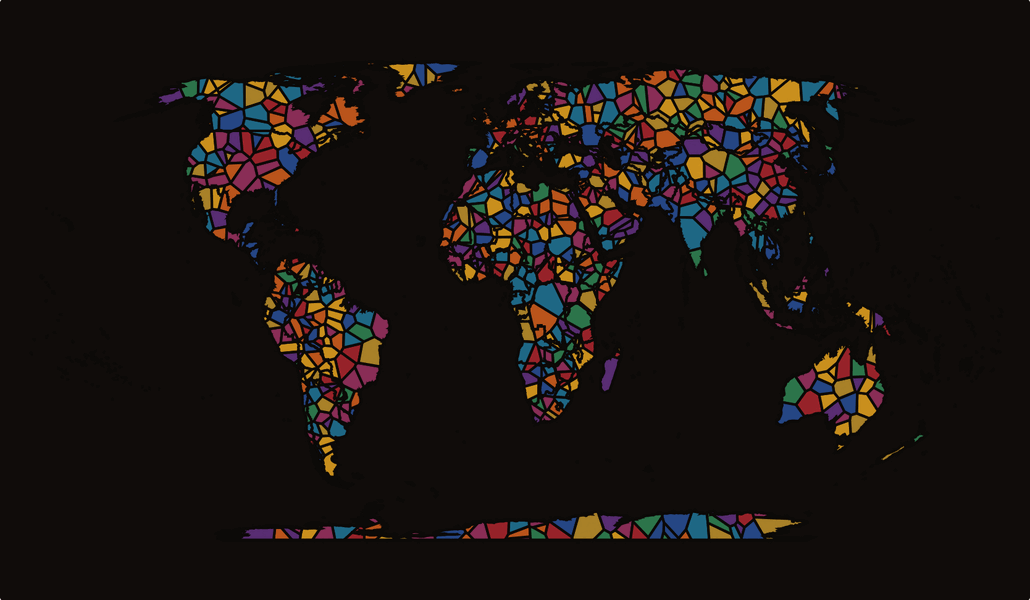
Points scattered across the land turn into Voronoi cells clipped to the real coastlines over a dark sea. Sort of like a backlit cathedral window.
I've spent a good amount of time on polygon names — most of that feeds the map data ontology — so here's Typographic Earth:
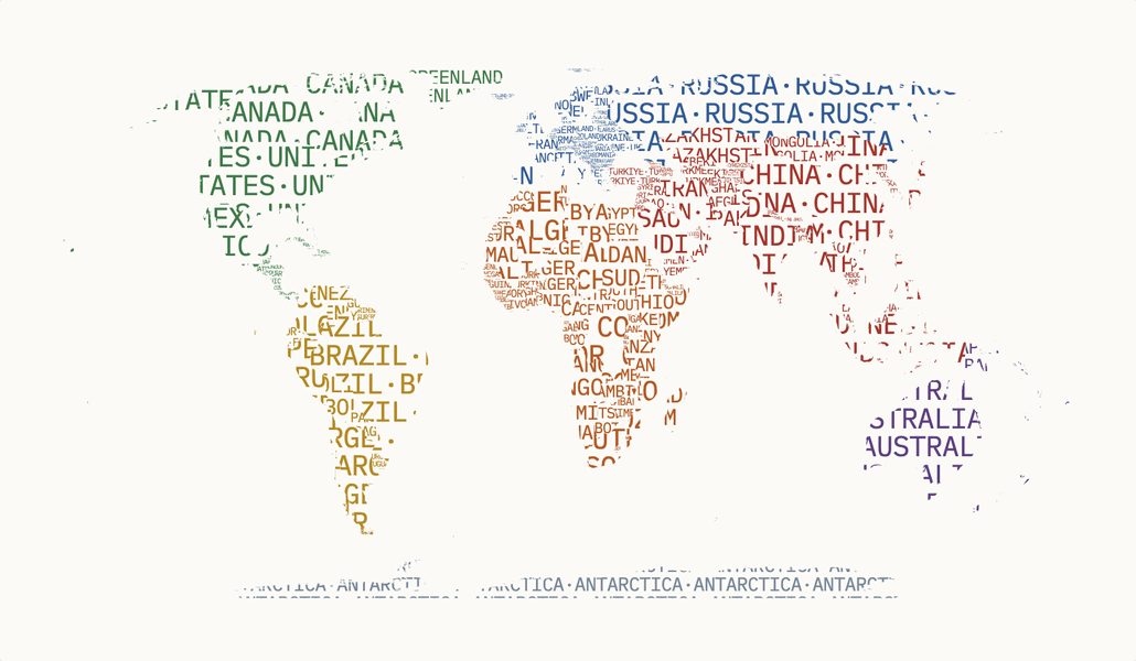
No borders are drawn at all. Each country is filled with its own name, repeated and tiled to the exact shape of its territory.
For more of this, check out map examples made with MapJSON.